LuPinXian 炉品仙
服务项目: 品牌视觉形象 PROJECT: Brand image
美术指导:K DESIGN DIRECTOR:K
设计师:Ernest、Tin9 DESIGNER:Ernest、Tin9
空间:谷云 SPACE:GUYUN
项目背景:
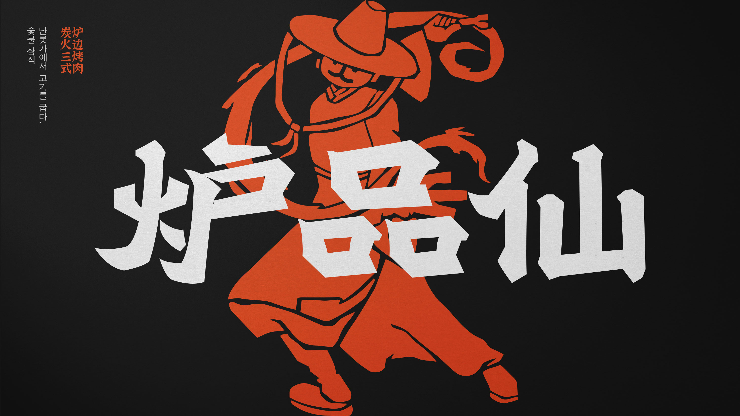
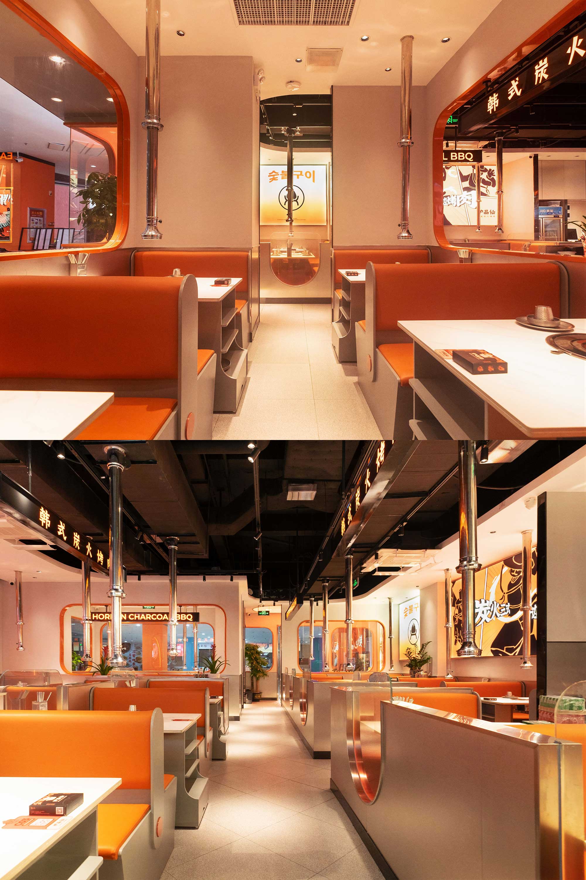
「炉品仙」 是一家创立于广州黄埔的韩式炭火烤肉品牌,主打优质肉品搭配丰富副食、小菜与酱料,让食客尽情自由搭配、感受韩国饮食文化。
设计概念:
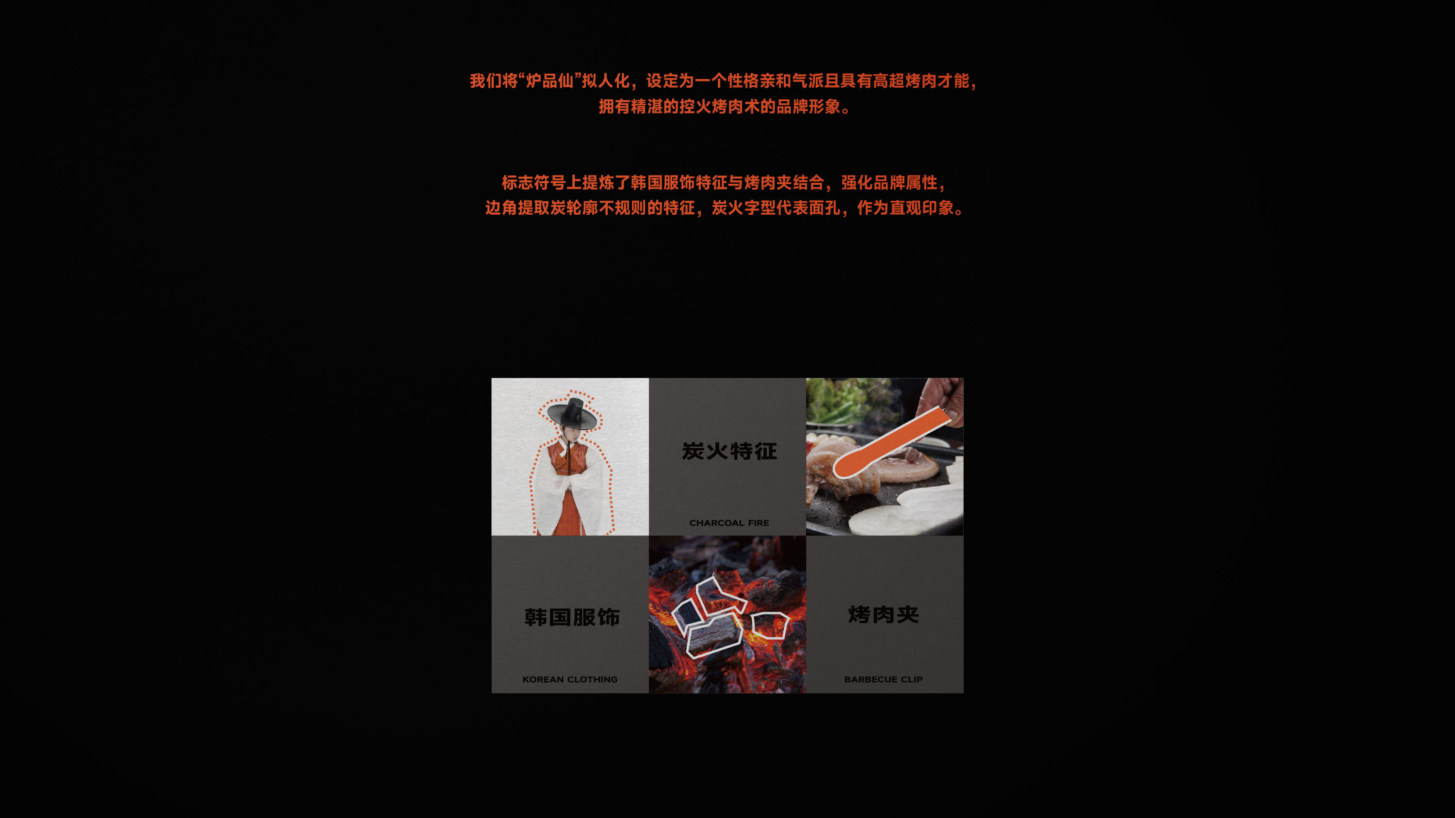
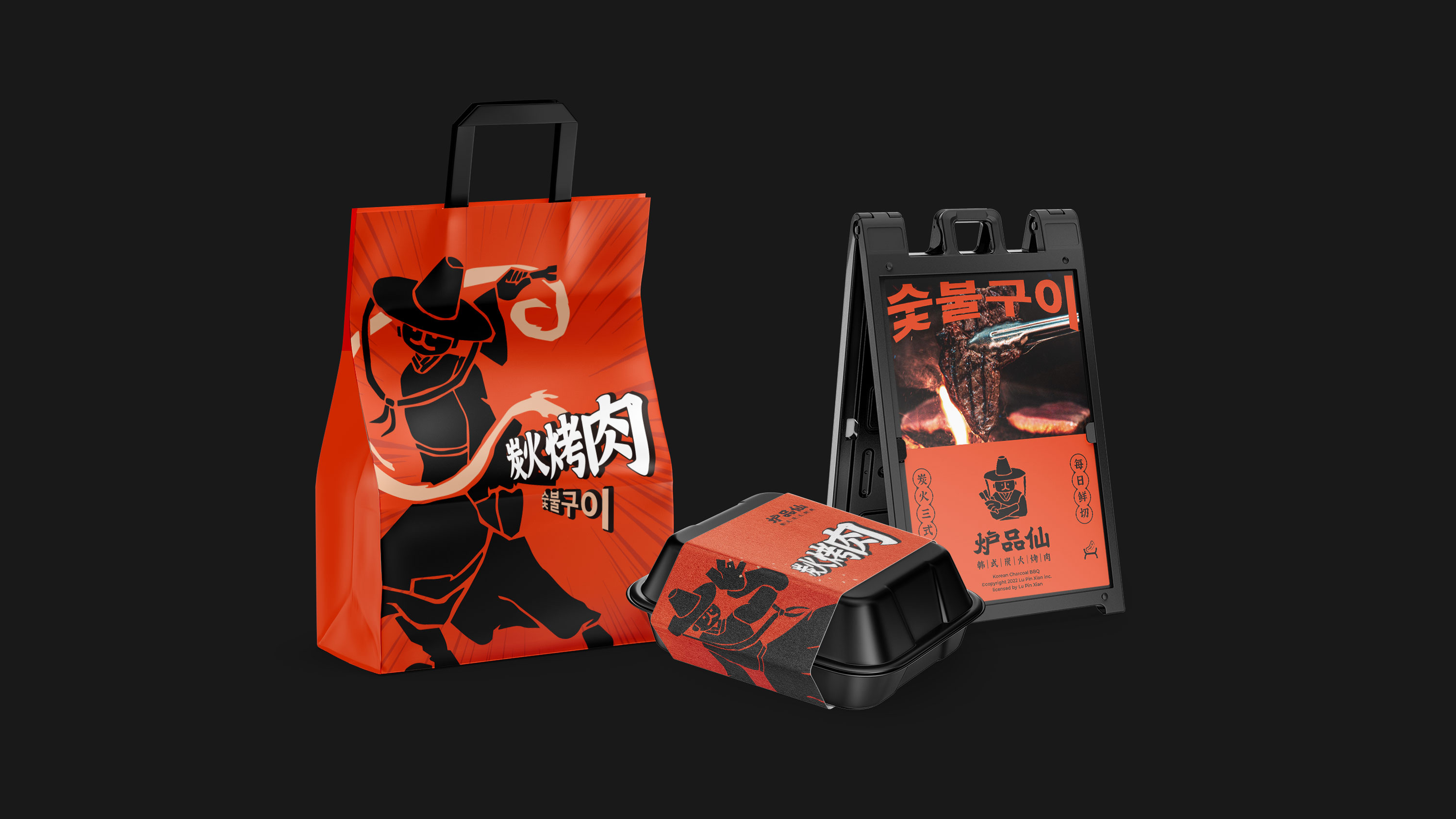
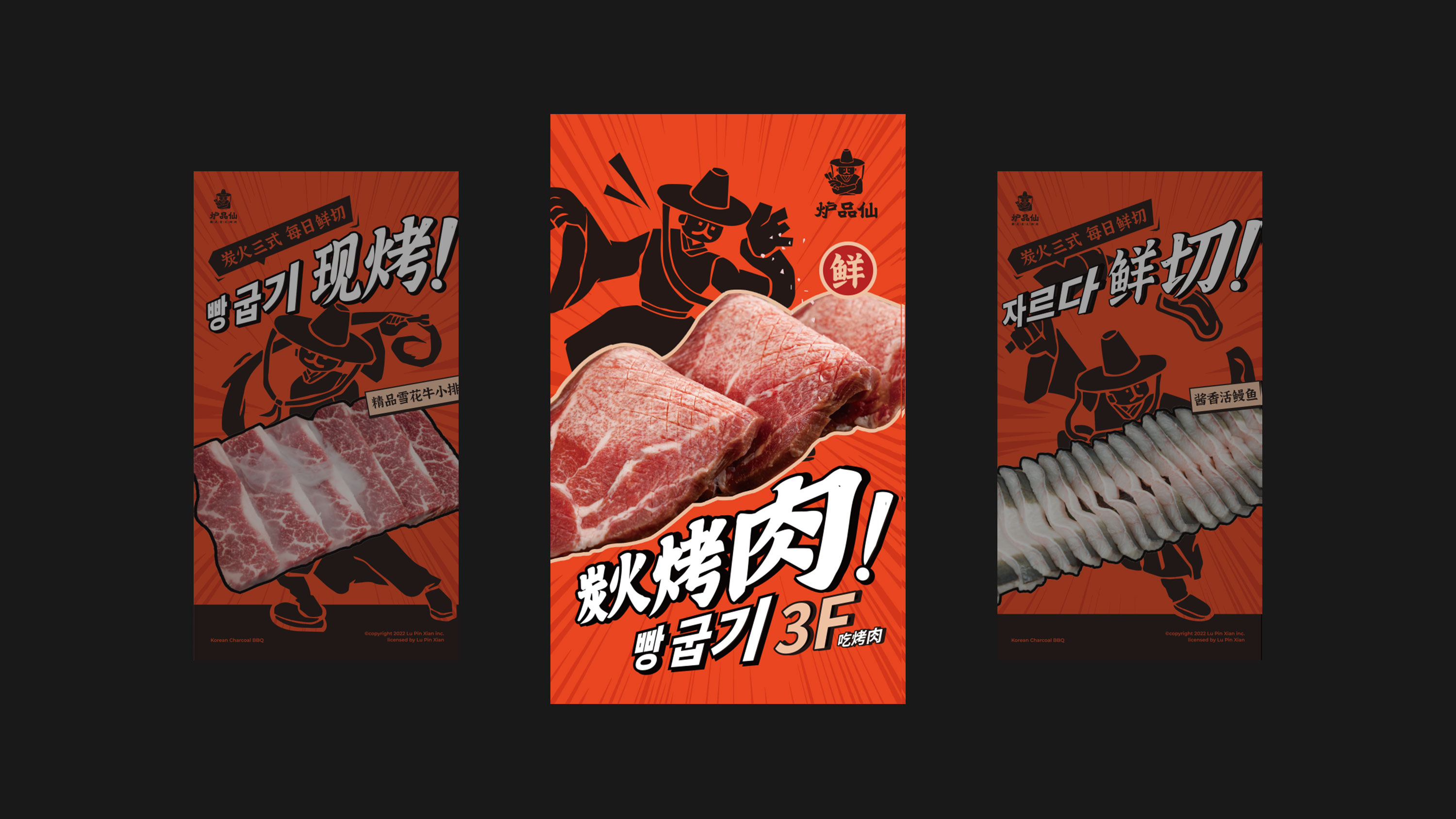
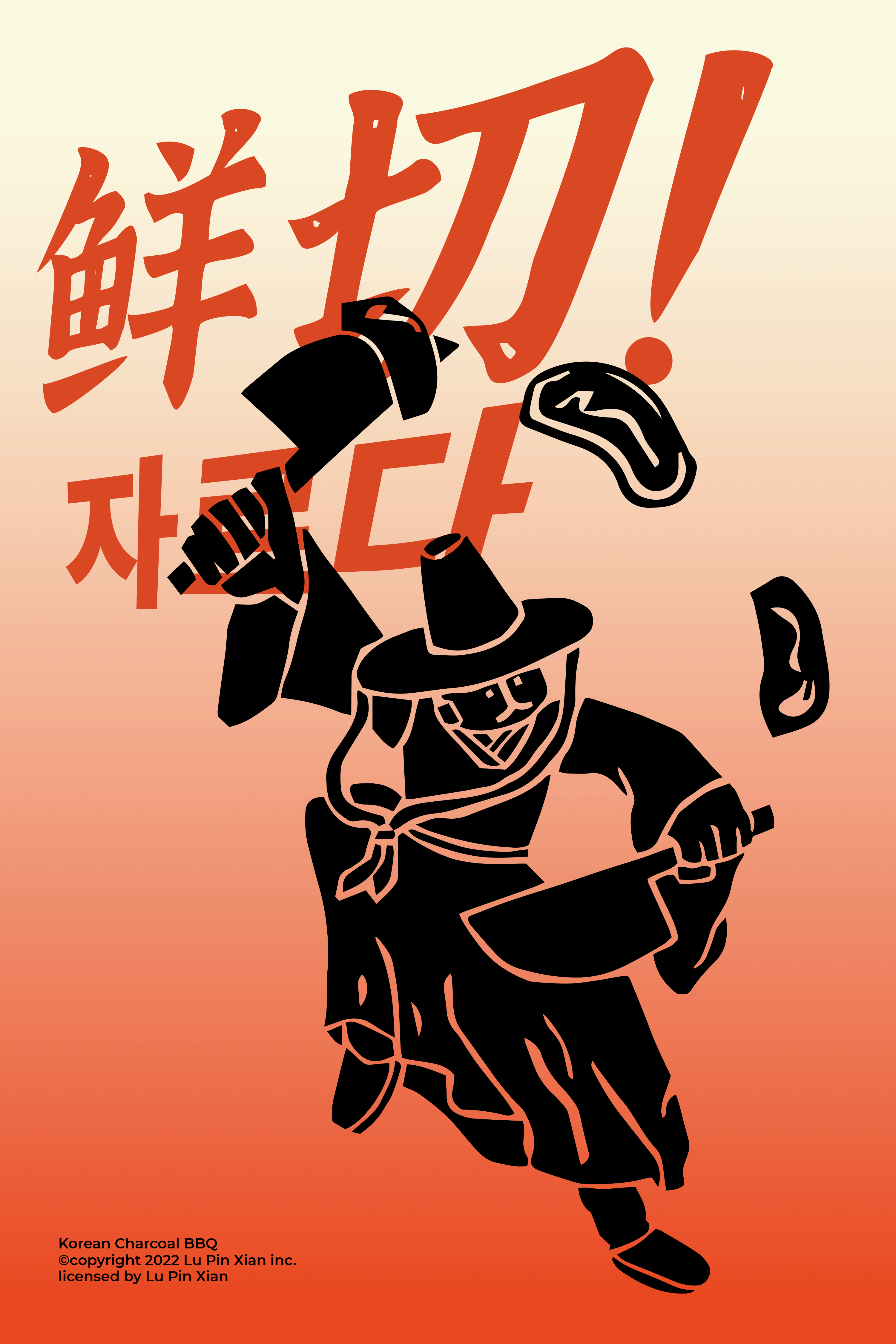
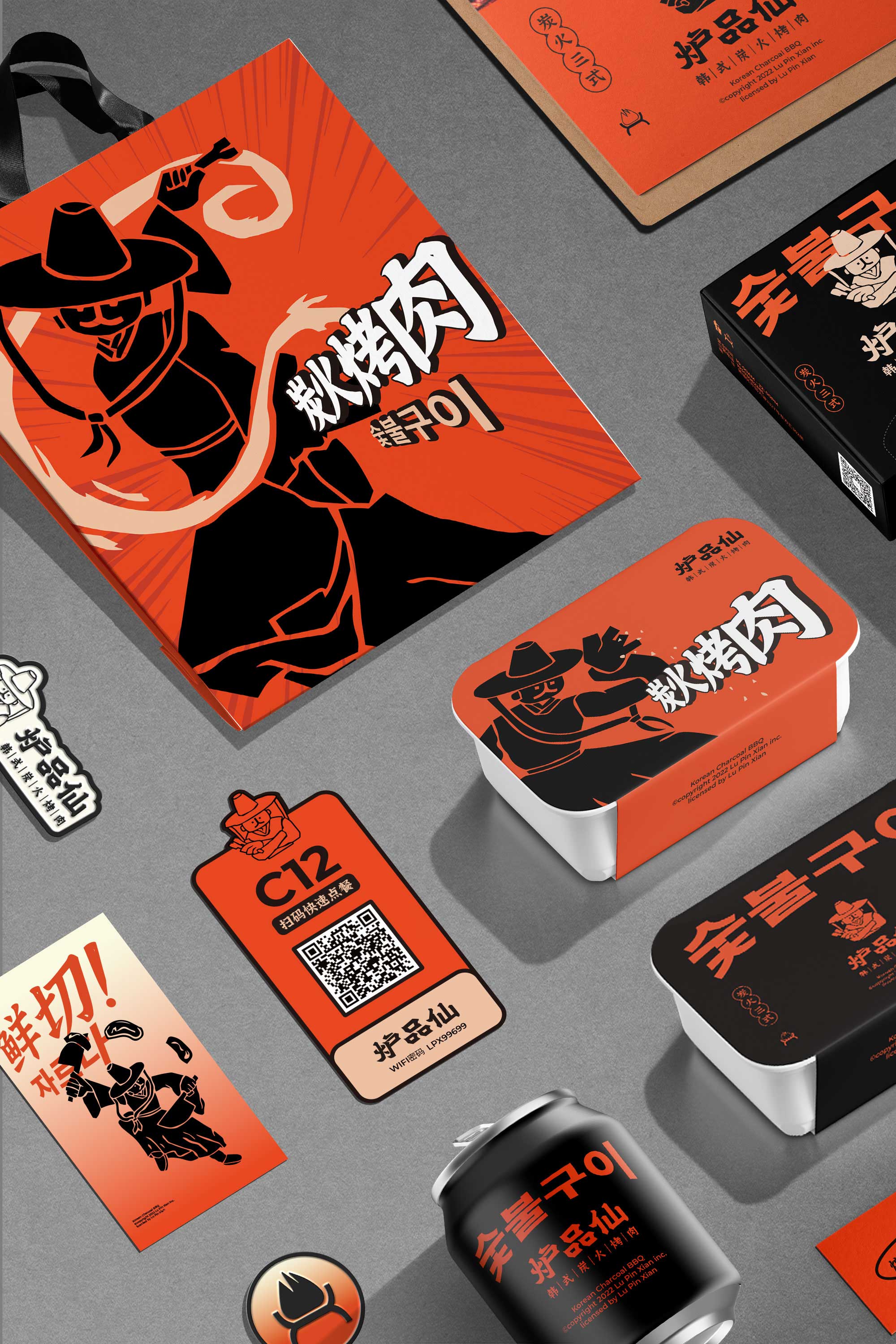
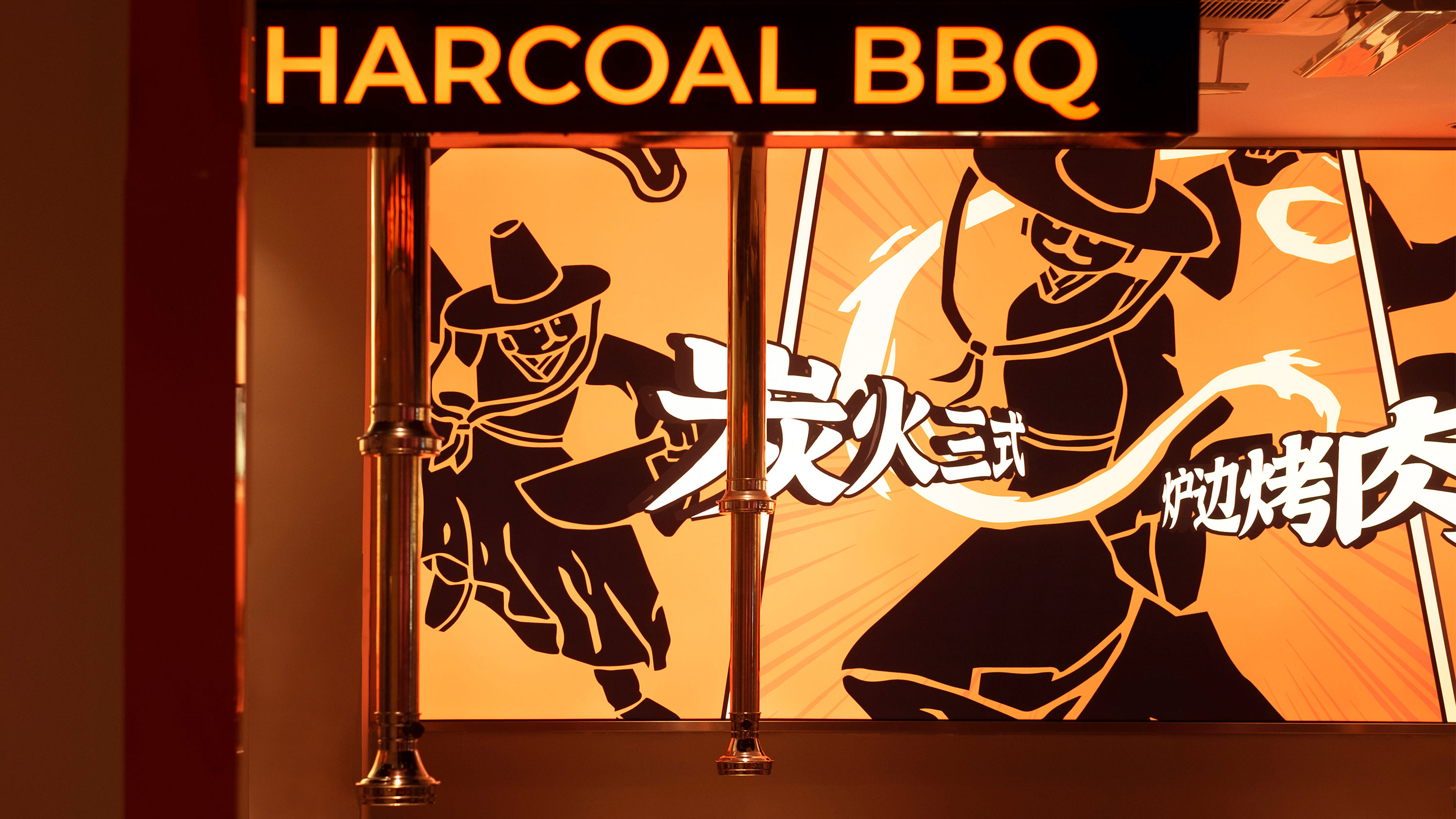
我们将“炉品仙”设定为一个性格亲和气派,具有高超烤肉才能,拥有精湛的控火(烤肉技能)术的品牌形象。标志提炼了韩国服饰特征与烤肉夹结合,强化品牌属性,边角提取炭粗犷,不规则的特征,炭火字型代表面孔,作为直接印象。色彩提取与炭火与鲜肉之间,以火力橙作为主要基调,围绕火燃烧的热烈进行展开。在ip设立上,我们秉承“炉中尚品一口鲜”品牌的的核心价值,以“鲜切、现烤、香蘸”为关键词,打造炉品仙的独门三式,带有故事性的叙事形象使品牌充满生动性。
Project background:
"Ropinxian" is a Korean-style charcoal barbecue brand founded in Huangpu, Guangzhou, focusing on high-quality meat with a variety of non-staple food, side dishes and sauces, so that diners can freely mix and feel the Korean food culture.
Design concept:
We will "furnace fairy" set as a character friendly style, with superb barbecue talent, with superb fire control (barbecue skills) of the brand image. The logo extracts the features of Korean clothing and combines with barbecue clips to strengthen the brand attributes. The corners extract the rough and irregular features of charcoal, and the charcoal fire font represents the face as a direct impression. Between the color extraction and charcoal fire and fresh meat, with fire orange as the main tone, around the warm fire burning. In the establishment of ip, we uphold the core value of the brand of "one fresh bite in the oven", with "fresh cut, baked, fragrant dip" as the key words, to create a unique three types of furnace fairy, with a narrative image of the story to make the brand full of vitality.


鹊时设计编辑部是创立于广州的一家垂直于生活方式品牌设计工作室。我们致信万物皆衡,与客户共创。为新零售连锁品牌提供品牌策略、品牌形象&空间设计等服务,业务涉及零售、餐饮、服装、教育等众多领域。
Add
OF COURSE CULTURAL & CREATIVE GUANGZHOU
2nd Floor, 8 Changgang West Road,Haizhu District, Guangzhou
Info
© 2018-2024 all rights reserved.

扫描二维码分享到微信