GUANGCHAO®觀巢
服务项目: 品牌包装形象 PROJECT: Brand Packaging
美术指导:K DESIGN DIRECTOR:K
设计师:TIn9 DESIGNER:TIn9
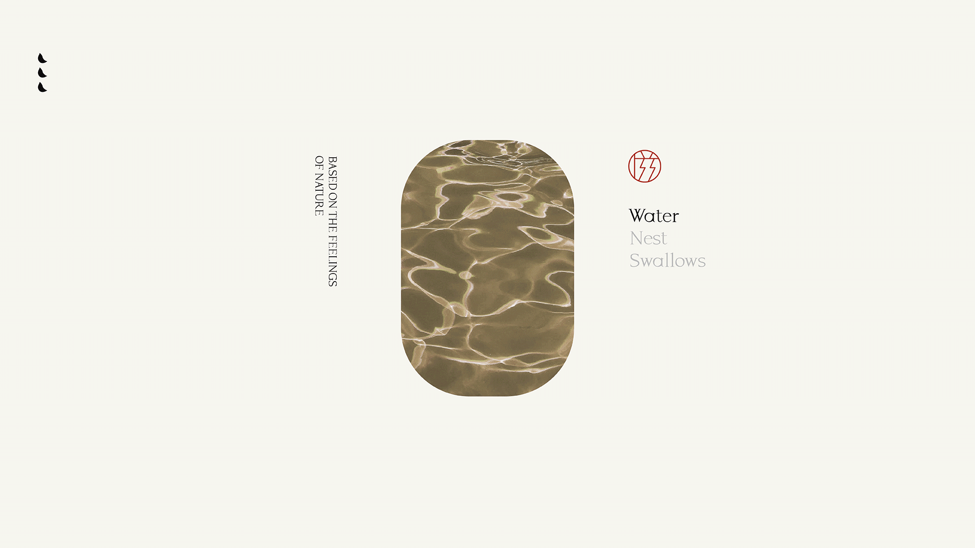
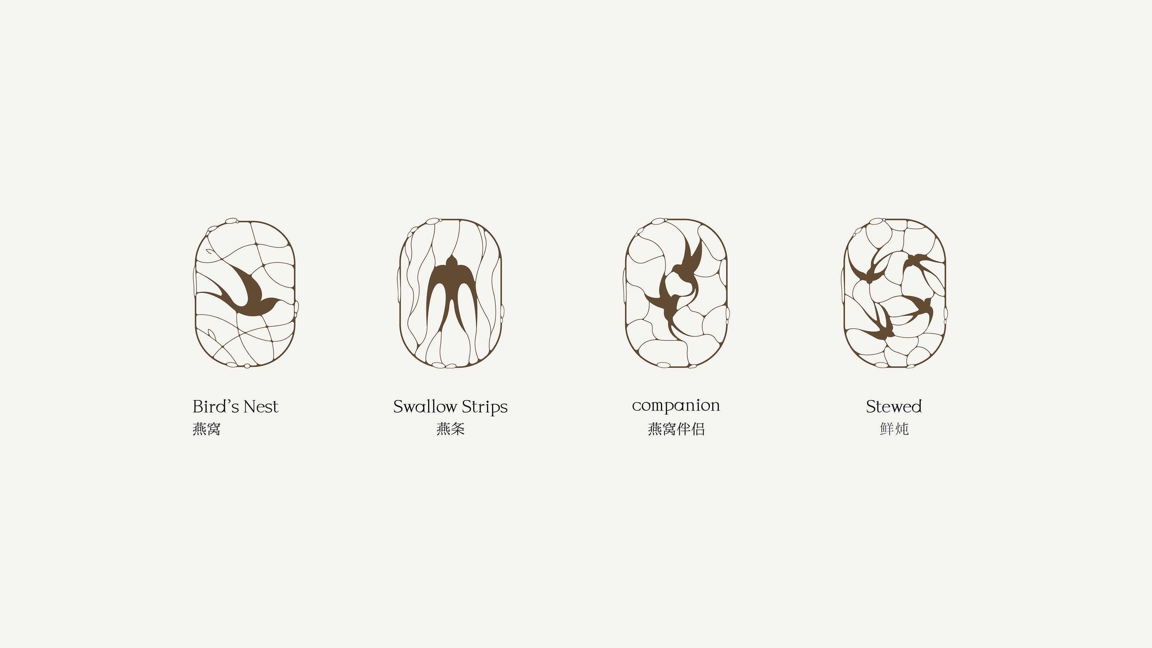
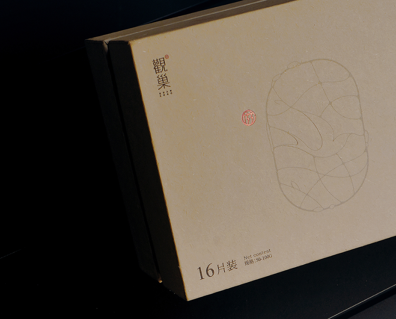
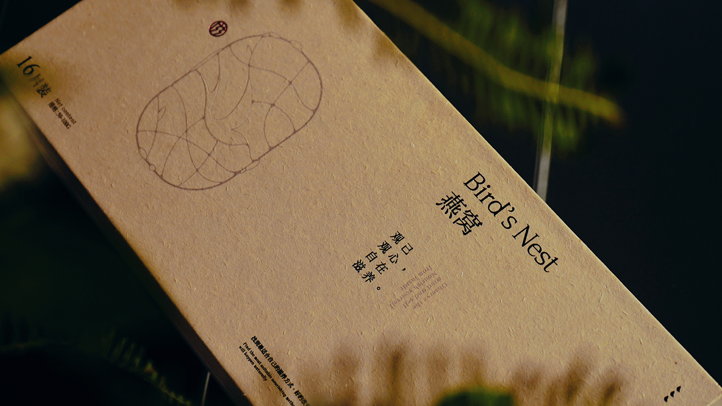
从自然获取滋养身体的能量,以滋养为出发点。燕窝属于流动性液态产品,我们提炼水与巢和产品特征,将燕子飞行的身姿融入其中,用丝线勾勒出不同形态的纹理,相织相融,丝丝可见。整体以浅色系为主,简洁中带点一丝中式人文的品质
Obtain the energy that nourishes the body from nature, with nourishment as the starting point. Bird's nest is a fluid liquid product. We refined the characteristics of water and nest, and integrated the flying figure of the swallow into it. We used silk threads to outline textures of different shapes, which are intertwined and blended, and the silk threads are visible. The overall design is mainly light-colored, with a hint of Chinese humanistic quality in its simplicity.
鹊时设计编辑部是创立于广州的一家垂直于生活方式品牌设计工作室。我们致信万物皆衡,与客户共创。为新零售连锁品牌提供品牌策略、品牌形象&空间设计等服务,业务涉及零售、餐饮、服装、教育等众多领域。
Add
OF COURSE CULTURAL & CREATIVE GUANGZHOU
2nd Floor, 8 Changgang West Road,Haizhu District, Guangzhou
Info
© 2018-2024 all rights reserved.
扫描二维码分享到微信