THE KAMANTAN
服务项目: 品牌形象视觉 PROJECT: Brand Image
美术指导:K DESIGN DIRECTOR:K
设计师:Ernest 、TIn9 DESIGNER:Ernest 、TIn9
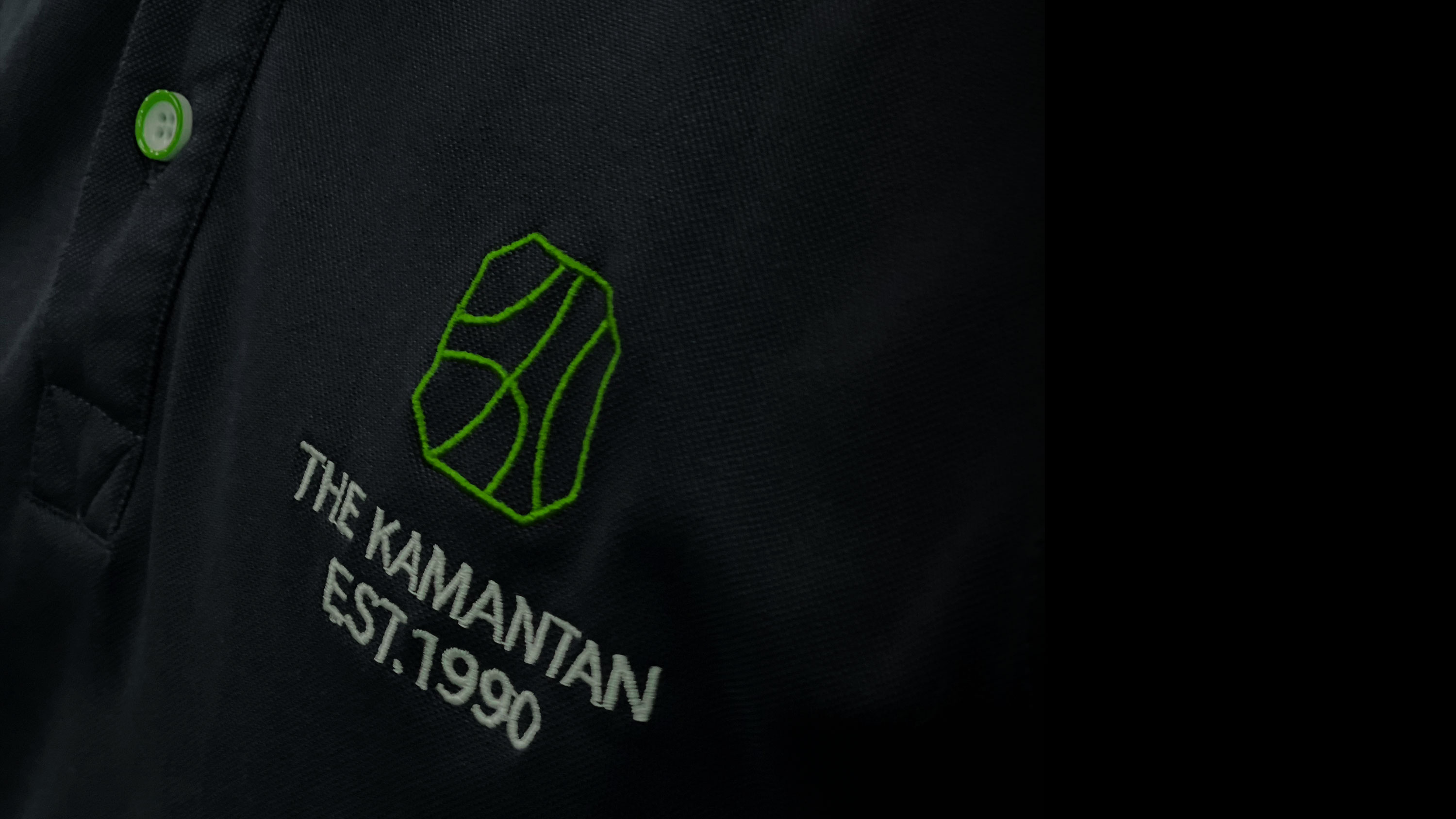
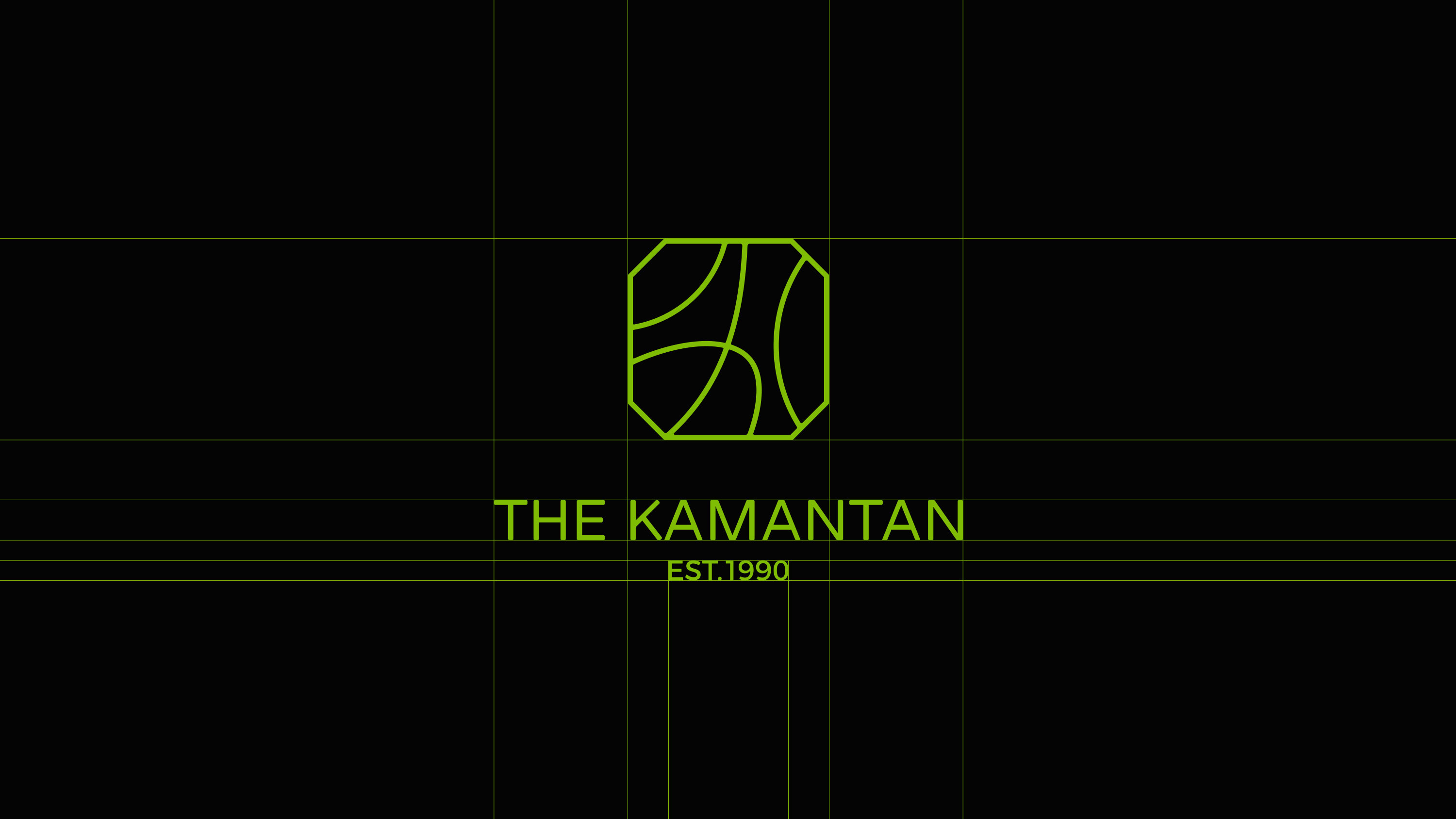
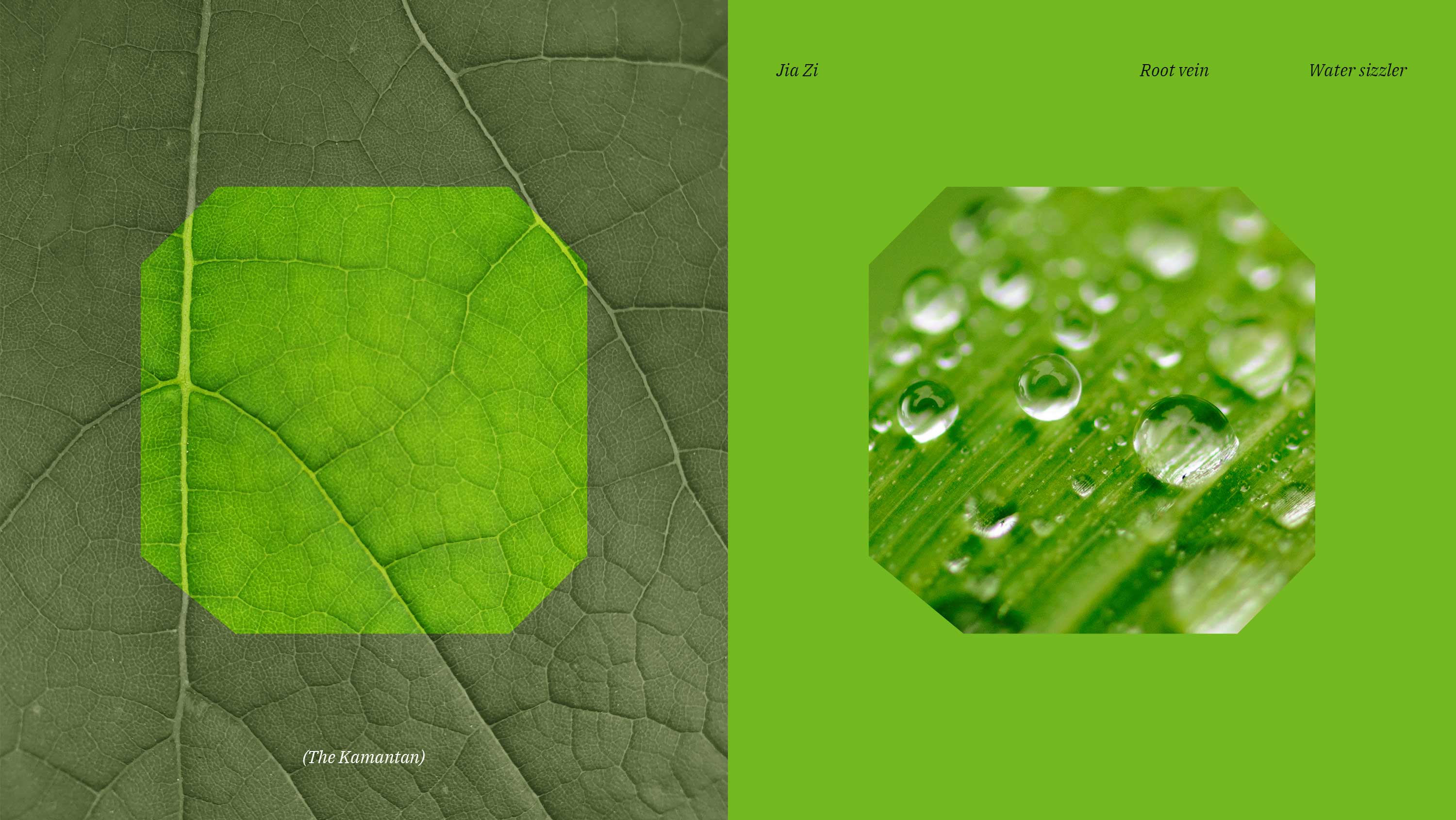
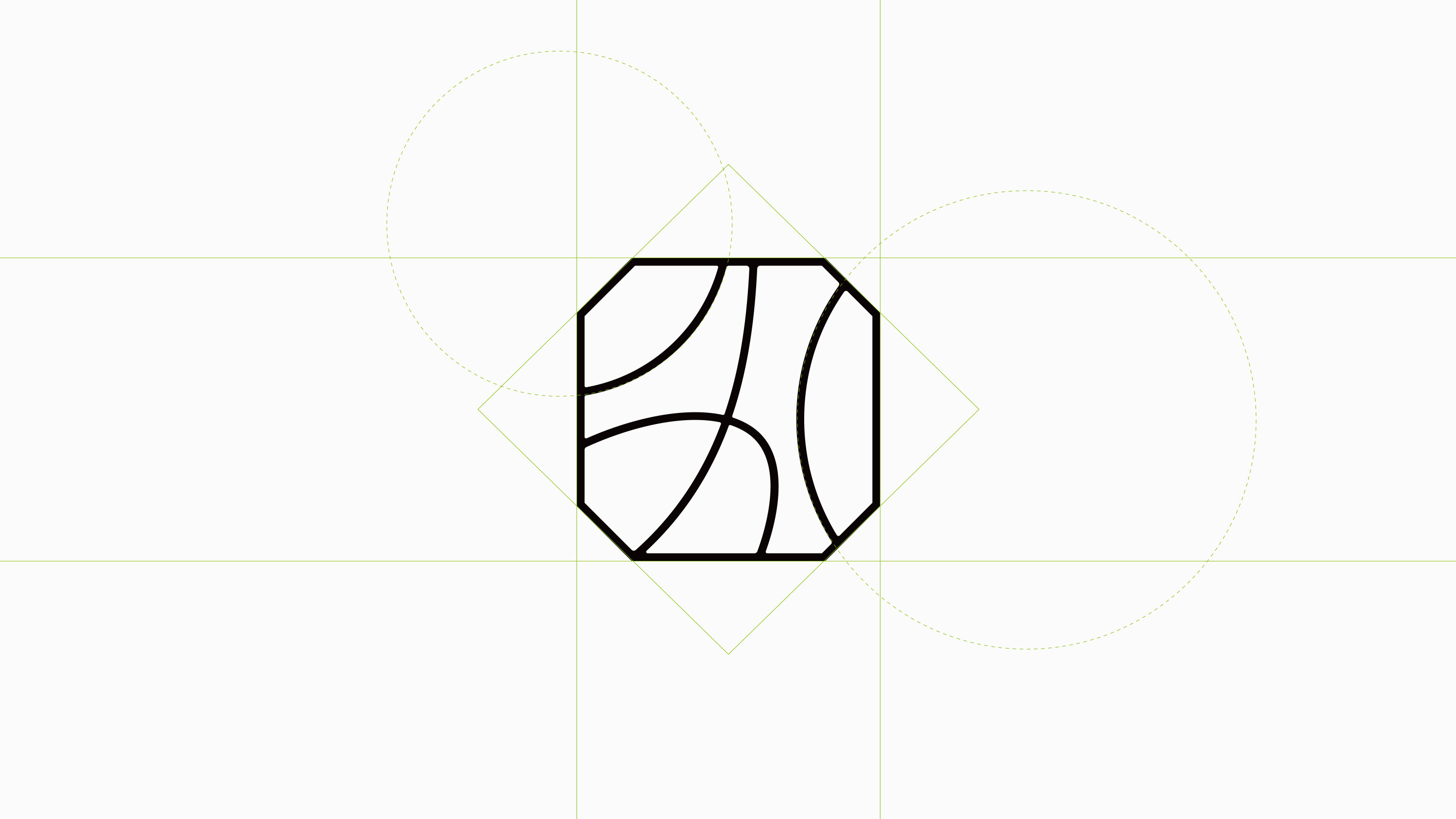
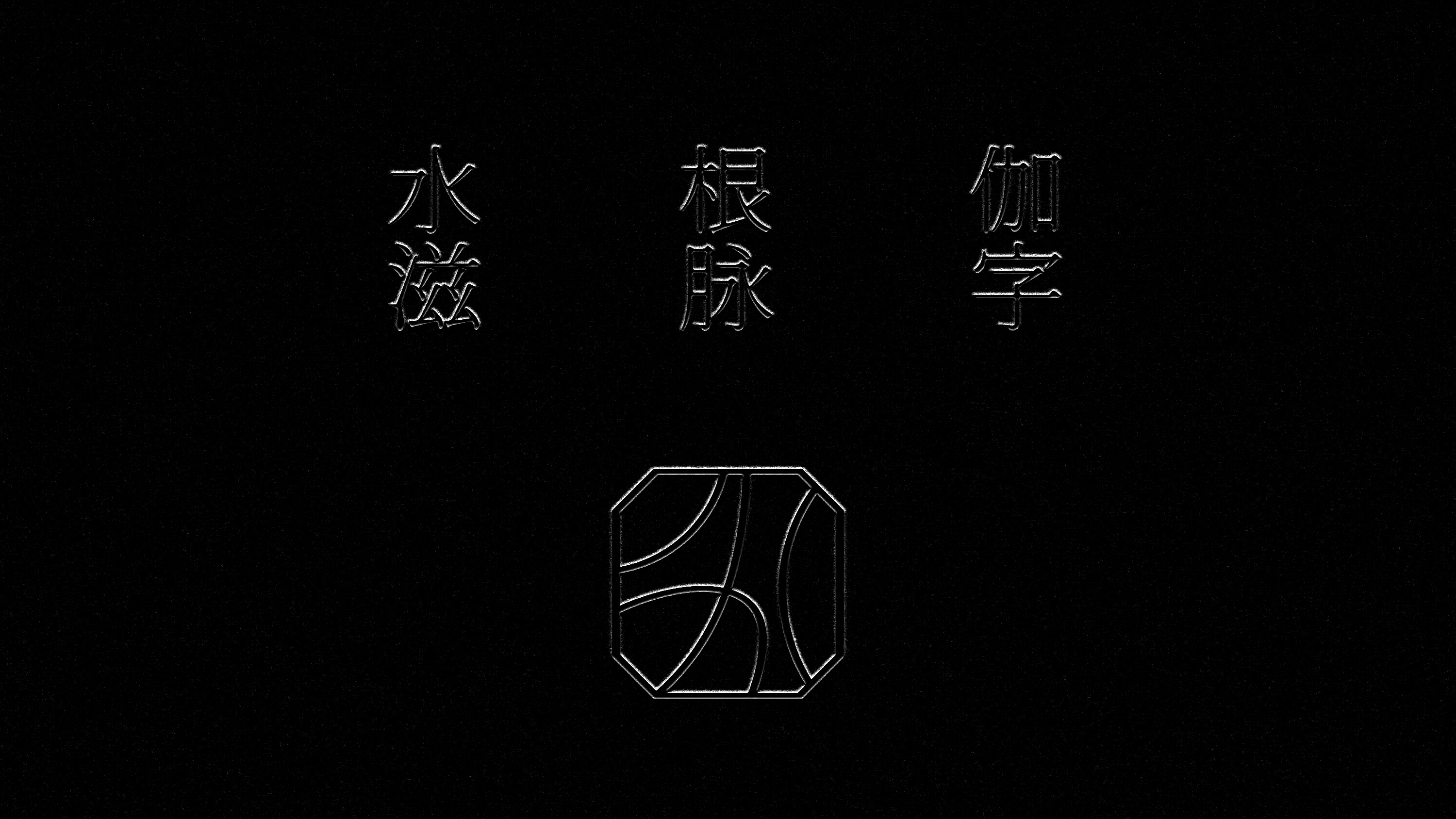
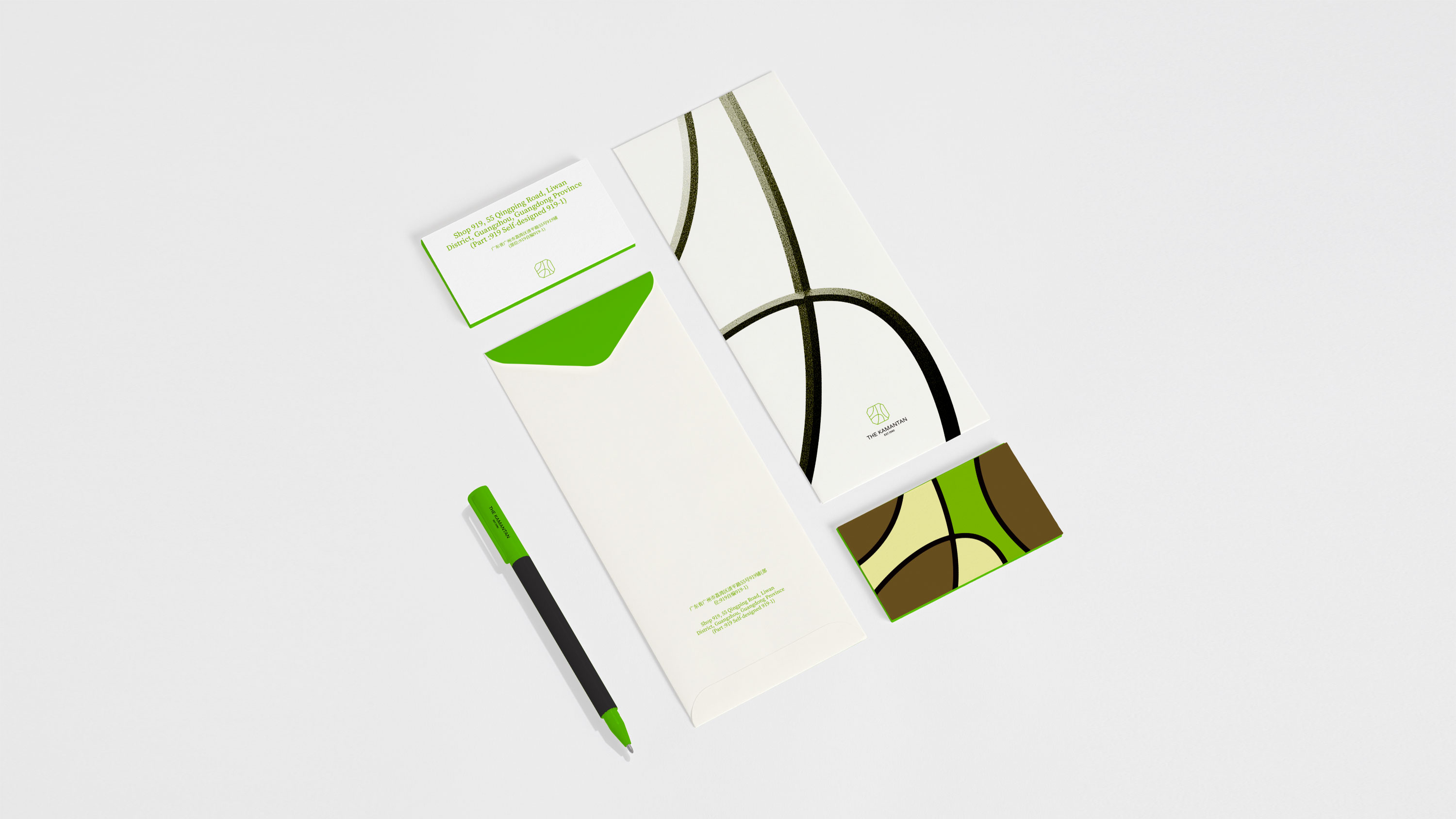
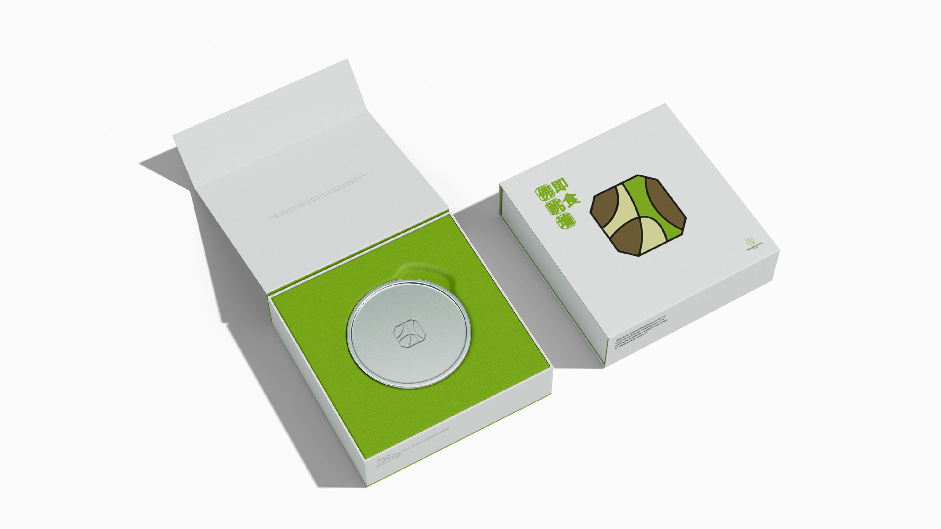
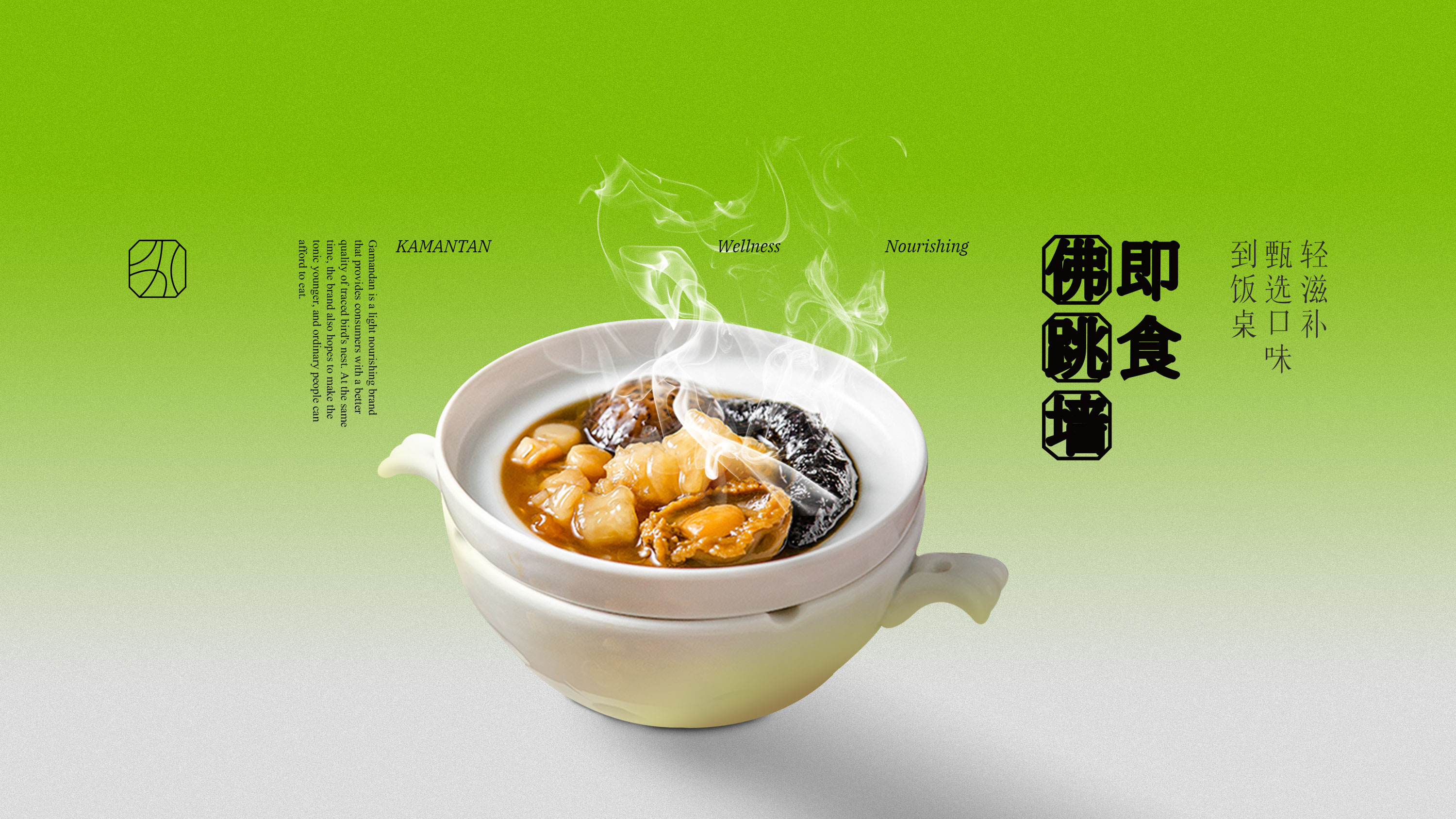
伽曼丹是一家立于广东,为消费者提供更优质的溯源码燕窝。同时也希望让滋补品更年轻化,普通人都吃得起。我们定义品牌关键词是自然、温润、滋养。我们模拟树叶的根脉与水滴滋养意境感,将“伽”设计为一个抽象的寓型。伽是好,曼是滋养,丹是颜色,自然流动之中,滋补且是细腻而曼妙的。
THE KAMANTAN is a company founded in Guangdong, to provide consumers with better quality traced bird's nest. At the same time, I also hope to make the tonic more young, ordinary people can afford to eat. We define the key words of the brand as natural, warm and nourishing. We simulate the root veins of leaves and water droplets to nourish the artistic conception, and design "Jia" as an abstract apartment. Jia is good, man is nourishing, Dan is color, natural flow, nourishing and is delicate and graceful.


鹊时设计编辑部是创立于广州的一家垂直于生活方式品牌设计工作室。我们致信万物皆衡,与客户共创。为新零售连锁品牌提供品牌策略、品牌形象&空间设计等服务,业务涉及零售、餐饮、服装、教育等众多领域。
Add
OF COURSE CULTURAL & CREATIVE GUANGZHOU
2nd Floor, 8 Changgang West Road,Haizhu District, Guangzhou
Info
© 2018-2024 all rights reserved.

扫描二维码分享到微信